If you want to use the Building an online store on the basis of WordPress, then you actually automatically come across WooCommerce. More than 1/3 of all online stores worldwide are operated with the Combination WordPress and WooCommerce regardless of the industry or the size of the product range. WooCommerce briefly explained: WooCommerce is a free software program that can be accessed from other software applications. With it, WordPress, the most common content management, can be transformed into an e-commerce solution, serving as the basis for an independent online store.
So, WooCommerce is a fully customizable e-commerce feature extension for WordPress, which greatly simplifies and facilitates the creation of an online store. WooCommerce is an open source solution. With it, any products can be set and offered in the store. In addition, WooCommerce can also be used as a billing module for extensions in WordPress such as services or the sale of online training. The easy integration of payment gateways such as PayPal greatly limits abandonment rates and ensures a faster cash flow than is often the case in other store systems.

For many companies, brands and retailers, e-commerce is still uncharted territory. (Illustration by Thierry Fousse from Icons8)
A standard setup of WooCommerce is done quickly - the challenge with every store lies in the realization of the individual requirements. We have listed some problems and stumbling blocks that you can often encounter when creating an online store.
Important in the creation of a store is the clear creation of the target group and a coherent design concept for it. Unfortunately, this aspect is often not recognized in its value and therefore neglected. A successful store requires a clearly thought-out concept, starting with the definition of the target group, through a consistent appearance, to the sales texts.
Customers feel comfortable only on web stores that are easy to use. If a store is complicated, cumbersome or unclear, it will not be successful. Newcomers to the online store sector in particular often have problems with user-friendly implementation. This starts with the presentation of the product range and extends to the loading speed of the pages and optimization for mobile users. If, for example, the checkout process is complicated and incomprehensible, potential buyers will drop out before they can complete the transaction.
If a store is to be profitable, the conversion rate must be right, i.e. the proportion of store visitors who ultimately actually put my product in the shopping cart and buy it. The goal should therefore be to increase and stabilize the conversion rate. Many clicks alone do not make the success.
Therefore, when creating a store, you must not forget to make an exact analysis of your target group and their buying behavior. The web design and the structure of your store must be coordinated with this.
Problems often occur when the importance of good hosting is underestimated during a store setup. A standard WooCommerce setup seems to be done quickly. (An SSL certificate is standard). The real challenge lies in the fact that the selected hosting can realize and optimally implement the individual circumstances and requirements of your store.
In case of a high order volume, the server may be down.
High order volumes occur, for example, around holidays such as Christmas or before Valentine's Day. If you sell items in your store that are particularly popular as gifts on such days, you may run the risk of your website going down because your server cannot handle the load of requests if your hoster is weak.
Your customers will mostly search for you via Google, and hopefully find you. And it is here that the next potential stumbling block appears: the SEO challenges. You must here Note areas such as product and category pages, filters, pagination. For beginners often big question marks and hurdles.
Internet use is strictly regulated in Germany, which also includes e-commerce. It is therefore absolutely necessary to obtain precise information and, if necessary, advice, especially in the legal area, in order to avoid warnings. The default installation of WooCommerce was developed for the American market. So you have to be aware that possible adaptations for the German market may be necessary. (Retrofit with plugin)
Many new store operators underestimate the extent of the preparatory work in the logistical area. This includes points such as shipping costs, returns, to which countries should be sold / shipped, compliance with legal requirements when shipping to the desired countries, different VAT rates, foreign currencies, possible payment options, inventory management, implementation after receipt of order, managing returns, complaints. The list could be extended almost endlessly.
You are happy when your customer base and your sales increase steadily over time. But with it, the work in the administrative area also grows. You have to create invoices, manage cancellations and returns, keep your accounting up to date, pay attention to the tax. It's easy to lose track of everything. A relief here is a suitable accounting software. With it you can create invoices and quotes or manage your customer orders and accounting.
When creating a WooCommerce online store, many aspects must be considered, and this from the very beginning. Otherwise, unnecessary problems and avoidable costs will arise. We are happy to assist you with our many years of expertise and fresh ideas. Our broad know-how helps you to build up your brand and also supports you with the growing technical requirements that an online store has to meet today. Together we develop a functioning store system to establish your offer optimally in the market and make it successful.
[vc_row css_animation=”” row_type=”row” use_row_as_full_screen_section=”no” type=”full_width” angled_section=”no” text_align=”left” background_image_as_pattern=”without_pattern”][vc_column][vc_column_text]
"Lorem ipsum" is probably the best-known dummy text par excellence. This has no special meaning, but should help to get an impression for the layout. Now there is also a simple solution for all Web designer and developers: Lorem Picsum.The use is very simple. You simply append the desired image size (width and height) to the URL of the tool and you get a suitable placeholder image.
Example of an image with the width 800px and the height 600px:
https://lochbronner.com/wp-content/uploads/2022/05/400.jpeg
The resulting image will look like this:

For square images, it is sufficient to specify the side length once:
https://picsum.photos/400
Instead of displaying a random image, you can also select a specific motif. For this you have to enter in the URL /id/{image} where {image} must be replaced with the image ID:
https://picsum.photos/id/1/200
A list with all motifs can be found here: Motif list Picsum
https://picsum.photos/200/300?grayscale
https://picsum.photos/200/300/?blur
The degree of blur can take a value between 1 and 10:
https://picsum.photos/200/300/?blur=5
Image in grayscale and with blur:
https://picsum.photos/id/870/200/300?grayscale&blur=3
More functions can be found on the official Website can be looked up. Have fun!
To allow visitors to your website to contact you, you don't necessarily need a complicated form. You can create a link with a single line of code that will send the most important information. When the link is clicked, the visitor's default email program will open and they can easily send you a message. You can even predefine parts of the content and subject line, as well as multiple recipients with just one line of code. How this works, you will learn in this article.
This link is a very simple link with no defaults. The code looks like this:
<a href="mailto:john.doe@domain.de">Write email</a>
With this code line you can directly specify who else should receive this email:
<a href="mailto:john.doe@domain.de,%20jane.doe@domain.de">Write email to two people</a>
This default is especially handy because you can easily recognize and filter e-mails based on the subject. So you know, for example, whether an email is important or urgent.
<a href="mailto:john.doe@domain.de?subject=Hier%20steht%20der%20Betreff">E-mail with subject</a>
This e-mail is sent by copy to another recipient. This address is visible to the one who composes the email.
<a href="mailto:john.doe@domain.de?cc=jane.doe@domain.de">E-mail with copy</a>
However, if you do not want the author of the e-mail to see who else the e-mail is being sent to, as in point 4, you can specify a so-called blind copy and have it sent.
<a href="mailto:john.doe@domain.de?bcc=jane.doe@domain.de">E-mail with blind copy</a>
You can also specify some content for the e-mails, but you have to keep in mind to specify the content in coded form.
An example might look like this:
<a href="mailto:john.doe@domain.de?body=Hallo%20John,%0D%0A%0D%0Ahier%20steht%20die%20Nachricht.">Write email</a>
Of course, you can not only specify the individual things as described in points 1-6. You can also combine everything and create a perfect email template with all the content you need from the author. Here you must note that all individual attributes must be connected with the abbreviation &, otherwise errors may occur or content may simply be missing.
<a href="mailto:john.doe@domain.de?subject=Hier%20steht%20der%20Betreff&body=Hallo%20John,%0D%0A%0D%0Ahier%20steht%20die%20Nachricht.">Write email with subject and prepared message</a>
As you can see, it is very easy to get as much information with just one link as with a form. You just have to create the link and insert it into your website at the desired place in the HTML code - done!
Technology is developing rapidly and so is the diversity of web design. Today, the possibilities in web design are almost limitless and there is plenty of scope for creativity to improve the user experience. In addition, the rules of the game for search engine optimization are changing fundamentally in 2018. Last year, it became clear that more and more people are visiting websites on mobile devices. Search engines such as Google are responding to this and are increasingly giving preference to mobile-optimized websites in their rankings. There are therefore some interesting trends in 2018. So let's get started, here are the 7 trends in web design that stand out and could be exciting for you.
This trend continues in 2018 and impresses with clear design and clear navigation. The user can navigate through the website as quickly as possible and is not distracted from the important content. The advantage of this design approach is that the loading time of the website is very fast and therefore perfect for search engine optimization (SEO). The focus is on the essentials, but there is room for creativity.

Apple's product page for the Mac Pro is kept simple in black and white. Source: www.apple.com/mac-pro/
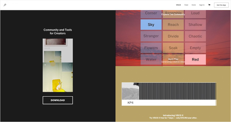
VSCO supports photographers - and relies on a simple homepage. Source: vsco.co
Shapes - colors - statements - the portfolio of designer Jean Baptiste Giffard. Source: digitaldesigner.cool
Over the last few years, flat design without much depth has become very popular. Clear, graphic and reduced to the important things. In 2018, this design is refined, with more depth through light shadows. From the user's perspective, this makes elements easier to distinguish from each other and helps direct the user's focus. The user experience (UX) improves significantly and important things can be brought to the fore better.
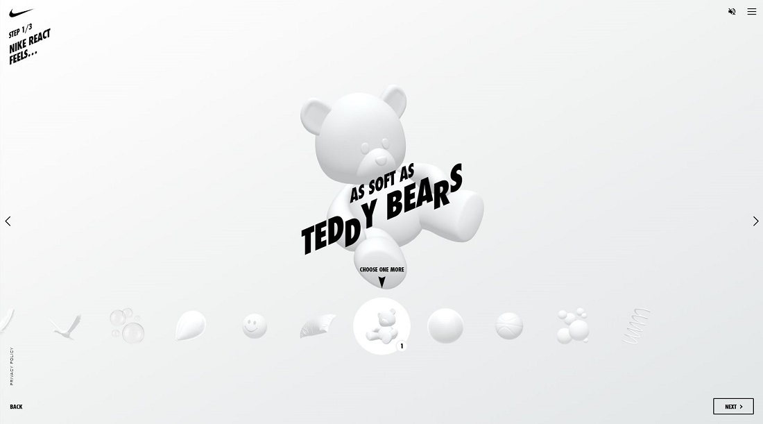
Nike React. Source: nike-react.com
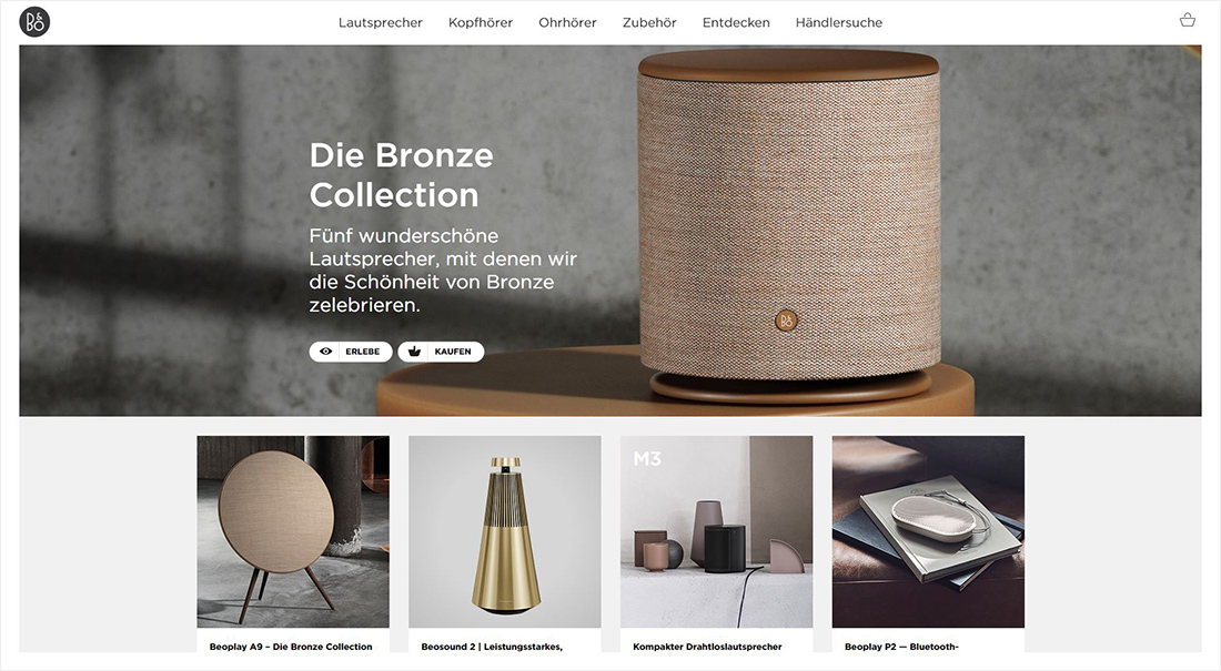
The use of contrast and appropriate imagery creates depth without distraction. Source: beoplay.com/en-en
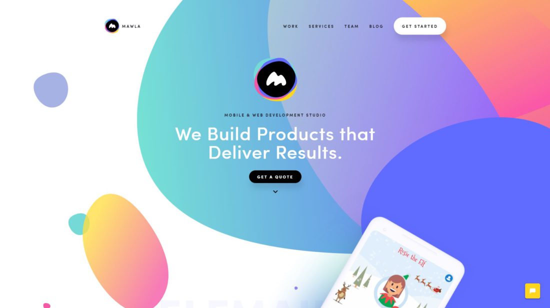
Looks flat yet three-dimensional. Source: mawla.io
Big companies like Spotify or Stripe are not afraid to use bold colors and gradients. Blue, purple, pink and green are way out in front. The transitions of the individual areas on the website are no longer straight and horizontal, but also sometimes diagonal, in wave form or a color gradient into the next area. Everything is a bit looser and yet clearly separated. In addition, dynamic scroll effects are often used, in which the content gradually appears the further you scroll. This makes the website look more dynamic and interesting.
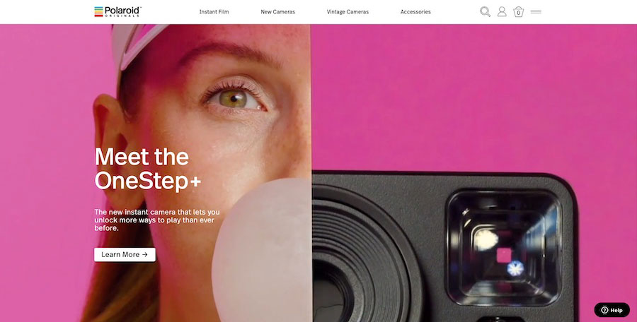
Source: eu.polaroidoriginals.com

Uber Sign Language. Source: ubersignlanguage.com
A big trend for 2018 is also the use of illustrations and animations instead of simple stock photos. Companies like Kontist, for example, work with illustrations created especially for them to match their own branding. Others are using gifs and cinemagraphs, for more entertainment and dynamism on the website. The content as a whole becomes more lively and authentic if you don't just use photos. The user usually stays longer on the website. However, you should not use too many such elements, so as not to reduce the loading time and make the page too choppy.

GUCCI Springsummer. Source: springsummer.gucci.com
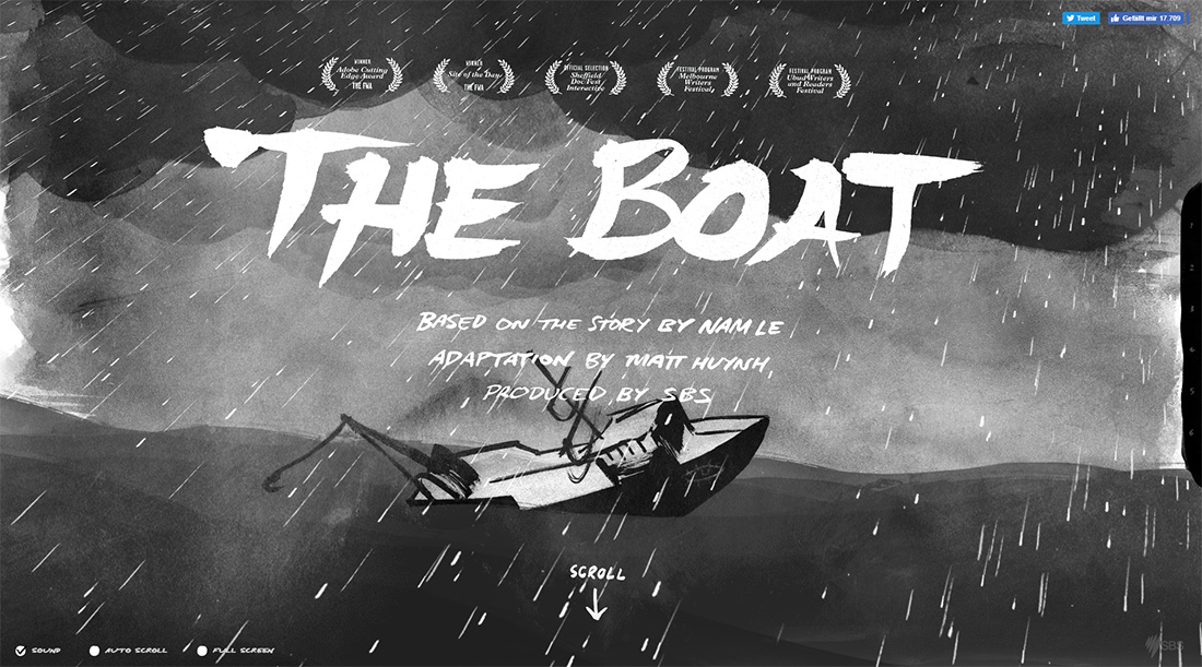
The Boat. Source: sbs.com.au/theboat/
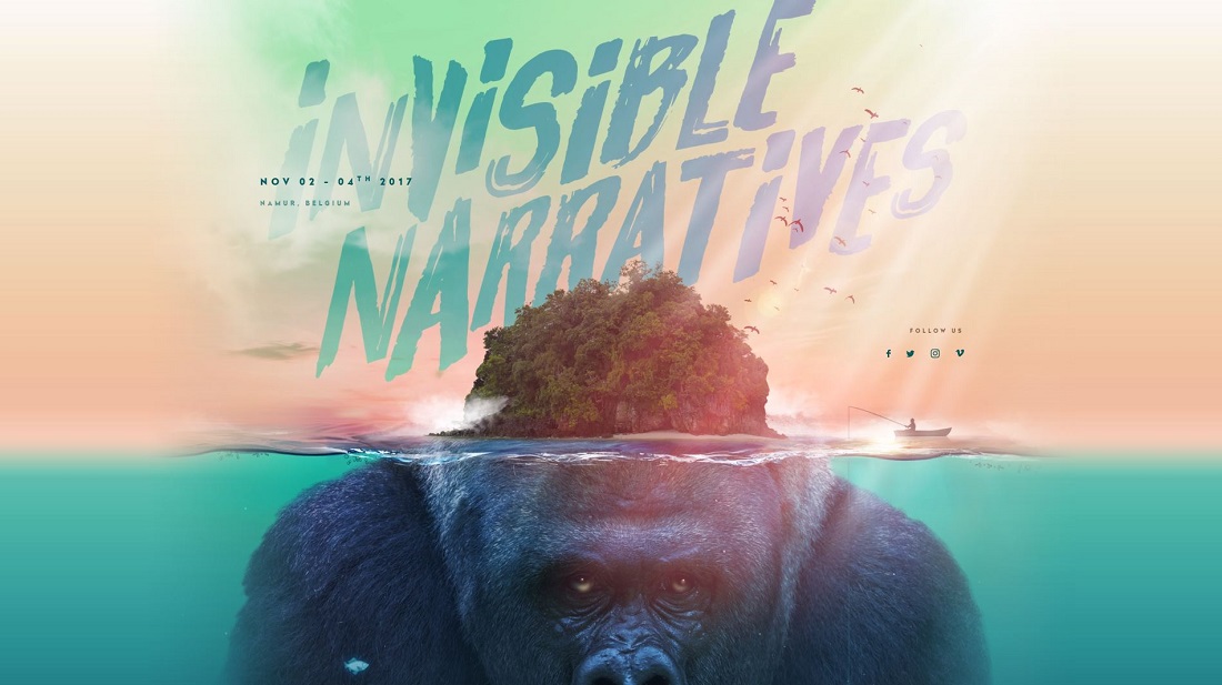
KIKK Festival with animated underwater world. Source: kikk.be/2017/
Until a few years ago, using fonts other than the standard ones available on a website was almost impossible. Today, thanks to high-resolution displays, you can dare to use special fonts and only need a few lines of CSS code. Especially serif fonts are on the rise and are used creatively. The user experience is improved and text can be made more legible. The focus of the user can be directed by the use of typography.
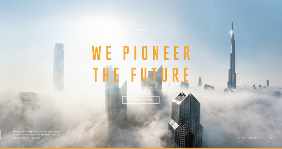
Clear statement from logistics company ACME. Source: acme-experience.com
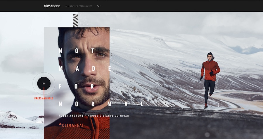
ADIDAS is going for typography with high mileage here. Source: adidas.co.uk/climazone
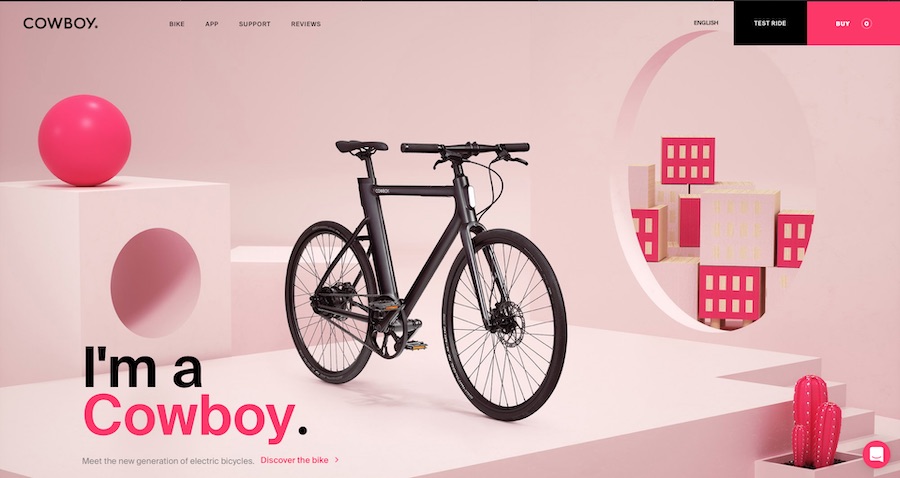
Minimalist, modern and with eye-catching typo. Source: cowboy.com
In the past, websites usually only focused on the product, but not on the people behind it. As a user, you could hardly get a picture of the people in the background and thus identify less with the brand. In 2018, it is particularly noticeable that photos of people are increasingly appearing on websites, regardless of whether this company offers products or services. Targeted storytelling creates more connection between the user and the company.
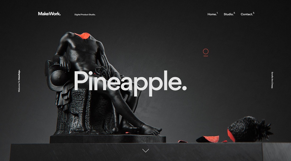
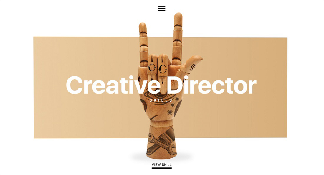
Here, separate images were rendered for each portfolio project - absolute top league. Source: makereign.com
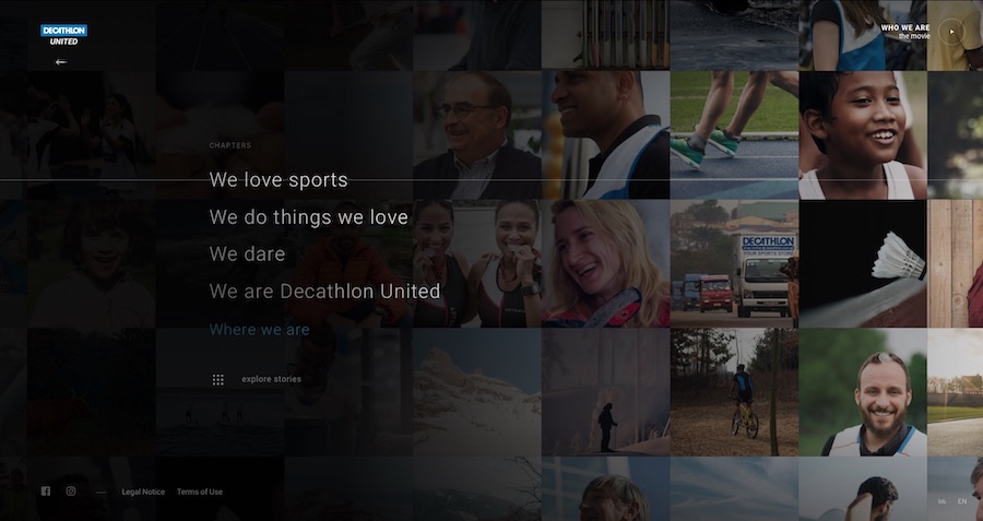
Images of people move and create authenticity. Source: decathlon-united.com
Pinterest led the way and tried something completely new in design. Now this trend has also arrived in web design 2018. The card design has the great advantage that the user can use the website intuitively and understand it easily. Moreover, this design is perfectly adaptable to mobile devices such as smartphones and tablets. Responsive design can be implemented perfectly, so that the website is displayed optimally on any device.
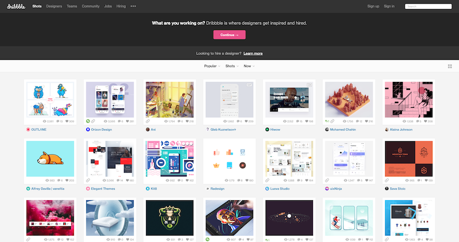
Here the user can quickly find his way around. Source: dribbble.com
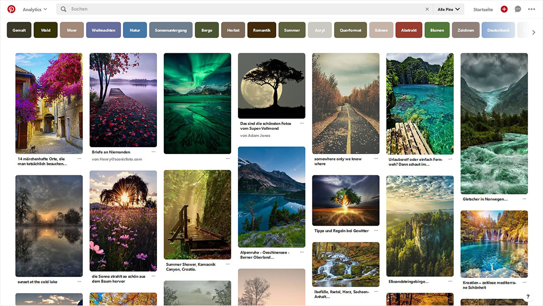
Pinterest is famous for the tile layout. Source: pinterest.com
The content can be creative in many ways, but you must never forget to optimize everything for mobile devices. Google has announced it. The ranking algorithm will be changed to mobile-first indexing in the long term. Websites should therefore be adapted for mobile devices at an early stage in order not to slip to the bottom of the ranking or even disappear completely. Responsive design is therefore very important since 2018 at the latest and should always be taken into account.
If you feel like giving your website a new look or need help optimizing it, get in touch with us! We'll be happy to help you creatively stage your website and optimize it for search engines. Come by for a cup of coffee and we'll discuss what we can do for you. We offer modern web design with responsive code and support in maintaining your website. Our team has years of experience and knows what your website needs to make your business even more successful. So book a non-binding consultationso that we can get to know you and your company. We are looking forward to meeting you!
What could be better than working on a local WordPress installation... Short loading times, full control, independence from remote servers and the internet! But before you can get started, you need a local development environment. Phew, sounds like work at first, but fortunately the web community provides many free tools, some of which have been doing an excellent job for over a decade. Local development of WordPress websites: Let's get started!
One of the most common methods is to install a ready-made Apache distribution on Windows or MAC. One of the best-known complete solutions here is definitely the free XAMPP. This open source package is extremely easy to install and is therefore particularly (but not exclusively) suitable for beginners. The package comes with the MariaDB database solution, PHP and Perl. Once the installation is complete, all you have to do is copy a WordPress installation into the htdocs directory and create a new database. Call up the URL - install WordPress - done! It can be that easy. Various tutorials are already available online like sand by the sea. On the official site WordPress.org page is awarded in the category Local Server Stack besides XAMPP also MAMP (for MAC only).
Another common solution is to work in a virtual environment. For this, a virtual machine must be used, i.e. a completely independent system is simulated by means of special software. For this there are various software such as Hyper-V, VMWare Fusion, VMWare Player and many more. For this article we will look at Oracles virtualization software VirtualBox more precisely. Once the software is installed, there are several ways to trigger a WordPress installation. In the following we will look at two particularly easy procedures.
Bitnami provides a large number of preconfigured open source packages, including a WordPress package. You download this and start it in the Virtual Box. This procedure creates a virtual Linux environment including a ready installed and configured WordPress installation. So you have to take care of almost nothing, but you are also bound to the finished package from Bitnami.
A tool whose name already reveals the intention of "local development": local by Flywheel. It was developed specifically for the simple local WordPress installation and is based on a virtual environment. Local by Flywheel is the insider tip for all those who not only want it to be uncomplicated, but are also into various extras, such as:
Those who host their WordPress site with this service can also put their local installation online without any additional tools.
Besides these easy to implement solutions, there are many other ways to create a local development environment for WordPress. These are rather recommended for more technically experienced users and will only be touched upon here.
With the help of VirtualBox and Vagrant, a Ruby application for creating and managing virtual machines, can be used to run a development environment optimized for WordPress. There is a special Vagrant configuration called Varying Vagrants Vagrantswhich was created specifically for WordPress development. Interested parties can for example at the VVV Tutorial on WordPress.org start
Similar to "normal" virtualization, but with some differences, which should not play a role here. Software for container virtualization is, for example Docker. For those interested is suitable the documentation in Docker Hub.
Happy Developing!
–
You are interested in the CMS WordPress? Maybe you are also interested in my article 13 reasons why WordPress is the best CMS for websites.
The more extensive a website project is, the longer and more confusing the CSS files become. So before you want to change something in the appearance, you first have to fight through countless lines of code to find the right place. Errors creep in, values cannot be reused, passages repeat themselves. As a CSS user, you wistfully look at other (programming) languages, which have useful functions like variables and so on.
Fortunately, there is a solution to this problem in the form of CSS preprocessors. The name already reveals that these are used at the beginning of the workflow. From slim files, in which "variables", "functions" and "mixins" can be used, the finished CSS files are created. The best known representatives are currently Sass, LESS and Stylus. Which of these preprocessors is used depends, among other things, on the respective project and your own preferences. In this article we would like to take a closer look at Sass, which we also use ourselves for the creation of (WordPress) websites.
By its own account, Sass is "the most mature, stable, and powerful professional grade CSS extension language in the world." It was released in 2007 and was developed by Hampton Catlin. On the official website you can find many examples and a detailed documentation: sass-lang.com
The core functions and thus basis of Sass are:
You can learn more about the individual functions below.
Who hasn't experienced this: certain values such as HEX codes are used across pages, but have to be retyped every time. If many different colors are used, it is often not immediately obvious which snippet should be copied. This can be remedied by variables to which you simply assign the desired values. These can then be reused at any point.
$font-family: 'Roboto', sans-serif;
$font-color: #111;

body {
   font: $font-family;
   color: $font-color;
}
This code is converted to:
body {
   font: 'Roboto', sans-serif;
   color: #111;
}Unlike HTML, CSS has no nesting capability. Sass, on the other hand, does, and this not only saves work but also promotes clarity.
.highlight {
   h1 {
      color: yellow;
   }

   a {
      text-decoration: underline;
   }

   p {
      font-weight: bold;
      font-size: 1.5rem;
   }
}
This code is converted to:
.highlight h1 {
   color: yellow;
}

.highlight a {
   text-decoration: underline;
}

.highlight p {
   font-weight: bold;
   font-size: 1.5rem;
}CSS already offers an import function, but it only requests another CSS file via HTTP. With Sass, on the other hand, multiple files can be merged into a single one.
// style.scss

body {
   background-color: #eee;
}

@import 'font';

footer {
   display: block;
}
// _font.scss

h1 {
   font-size: 2rem;
   color: #aaa;
}
These two separate SCSS files are combined and the following code is obtained:
body {
   background-color: #eee;
}

h1 {
   font-size: 2rem;
   color: #aaa;
}

footer {
   display: block;
}
It is recommended to work with a reasonable number of such import files for larger projects, so that the overview can be maintained. Another advantage is that in this way individual modules can also be used in another project. It should be noted that the names of the SCSS files to be imported must begin with an underscore.
Recurring functions and templates, called mixins, are another useful extension that makes it easier for you to work with CSS files. Once you create a template, you can use it as often as you like throughout your project.
@mixin border-radius($radius) {
   -webkit-border-radius: $radius;
   -moz-border-radius: $radius;
   -ms-border-radius: $radius;
   border-radius: $radius;
}

.button {
   @include border-radius(20px);
}
This code is interpreted as follows:
.button {
   -webkit-border-radius: 20px;
   -moz-border-radius: 20px;
   -ms-border-radius: 20px;
   border-radius: 20px;
}Another way to save superfluous code. Existing CSS selectors are simply extended by placeholders.
%meldung {
   border: 2px dotted #000;
   padding: 5px 10px;
   font-weight: 800;
}

.message {
   @extend 1TP2Message;
}

.success {
   @extend 1TP2Message;
   color: green;
}

.error {
   @extend 1TP2Message;
   color: red;
}

.warning {
   @extend 1TP2Message;
   color: yellow;
}
This code is converted to:
.message, .success, .error, .warning {
   border: 2px dotted #000;
   padding: 5px 10px;
   font-weight: 800;
}

.success {
   color: green;
}

.error {
   color: red;
}

.warning {
   color: yellow;
}From time to time it is necessary to make mathematical calculations in CSS. Sass provides the necessary operators for this.
.main {
   width: 800px / 960px * 100%;
}
This then becomes:
.main {
   width: 83.33333%;
}For this you need a suitable compiler. We currently use Prepros for Windows, but there are also numerous other representatives such as CodeKit (Mac) and Compass (Windows + Mac).
[Update: since 2017 there is now the possibility to use variables without preprocessor, see also CSS Custom Properties; we still recommend the use of preprocessors like Sass or LESS, because variables are not the only feature].
Frameworks have become an important part of the WordPress landscape. They add numerous features to the CMS and make life easier for WordPress developers and users alike.
In this article we would like to address the following questions:
In a way, a framework is a special type of WordPress theme or WordPress plugin that influences the appearance and functions of the website. There are various ways in which such a framework can be integrated, for example as a parent theme (with its own child themes), as a stand-alone theme (without child themes), or as a plugin (supplemented by a suitable theme). The main difference between a (starter) theme and a framework is that the former only uses the core functionalities of WordPress, while the latter extends them. So if you are only looking for "visual assistance" when developing a WordPress website, a simple theme is already sufficient. If, on the other hand, you want to extend the basic functions of WordPress, you can help yourself to the ever-expanding framework gift table.
WordPress framework developers, by and large, serve two distinct areas of use:
Advantage #1: A framework can be a real kickstarter for a new WordPress project because you don't start from scratch, but can fall back on the development work of other programmers. The large community, which provides a constant stream of new themes, plugins and code snippets, especially for the most popular frameworks, makes the work much easier and the entire user community can benefit from it.
Advantage #2: Frameworks make a site very updateable and customizable. No matter if a new theme version is installed or the appearance is changed completely, the basic functions of the framework as well as the settings defined there are always preserved. For updates, most frameworks already provide a button in the backend, which is why the user does not have to deal with a manual update via FTP.
Advantage #3: Security and SEO - by using (strong) frameworks, the entire website benefits from increased security and improved search engine friendliness.
Unfortunately, a blanket answer to this question cannot be given, because websites and their creators/users are simply too different for that. Each developer or web designer has personal preferences, and each framework also provides different functions. Therefore, there can be no overall winner for every use case. The choice must therefore be made individually in each case. At least an overview of the currently popular WordPress frameworks (as of 2017) can be given here:
At this point a big Thank you to all contributors who make the use of great frameworks possible!
–
You may also be interested in my article on this topic "13 reasons why WordPress is the best CMS for websites“.
How is a web design actually created? Or to put it another way - where do you start? Every web designer certainly has their own approach, which is tailored to their individual way of working. Leaving personal preferences aside, you could at least ask yourself for which end device the first designs should be created. Do you start with high-resolution screens for desktops? Or with notebooks? This is where the mobile first approach comes in. As the name suggests, you start with the design for mobile devices or with the smallest layout variant. Then you gradually move towards the larger variants.
But where does the mobile first trend actually come from? In the past, a desktop version was usually created first, to which a mobile version was then optionally added. However, as websites are increasingly being used on mobile devices such as smartphones, priorities are shifting. For some sites, the mobile version has long been more important than its "big brother".
At the latest after this announcement, it is clear how dominant the role of mobile web design has become: Google is introducing its own index that specifically lists mobile versions of websites. A fully-fledged mobile website is therefore more important than ever before if you want to continue to maintain good search engine rankings. The mobile-first trend could get an additional boost as a result.
The entire website can benefit from the mobile first approach - after all, the focus is on the content. The website is concentrated on the essentials and important content is as dominant as possible, i.e. positioned as high up as possible. In a later step, the desktop version can be created on this solid basis and additional functions can be added. At best, this also increases the usability of a website.
There are several ways to develop a mobile-first website. In practice, the following has proven to be particularly effective Responsive web design which can be optimally combined.
The Responsive web design has provided a great improvement in the usability of websites on different devices. Websites with a responsive layout are no longer rigid in their design, but adapt dynamically to screens of different sizes. An important cornerstone for responsive web design was laid by the American web designer Ethan Marcotte in an article in 2010, in which Marcotte also introduced the CSS "media queries", which are now important components of many websites.
For a long time, Responsive Web Design was not a very big topic. Only with the increasing spread of smartphones (first and foremost the iPhone) and other internet-capable devices did this discipline get a real boost. As a self-experiment, you can use a smartphone to look at a website that was created in the early 2000s and has not been revised since. It quickly becomes clear that usability leaves a lot to be desired here. Fonts are too small, pages are overcrowded and links are only clickable with a magnifying glass. Quickly researching the opening hours of a local store can be a real test of patience. One of several solutions to overcome this problem is responsive web design.
The biggest challenge of responsive web design is probably the large number of different devices with their different screen sizes. From very small smartphone displays, tablets and notebooks to large monitors - a website should be displayed optimally on every device. However, it is not only the dimensions that vary, but also the resolution density. For example, the Retina display of the iPhone 6 has a pixel density of 326 ppi, while that of the MacBook Pro with Retina display is only 227.
Moreover, mobile devices work differently than the desktop computer. Here, there are no mouse cursors that could activate hover states. Clickable areas must therefore be all the more recognizable as such. Ultimately, the goal is to do justice to each individual device and thus provide all website users with optimal display and operation.
In order for a website to be displayed optimally on every device, it must be able to query certain information. This includes, for example, the available space or the device orientation (portrait/landscape format). So-called CSS media queries are used for this purpose. These are already familiar from other areas of application - style sheets are often provided for a specific browser or for printing.
With the help of the media queries (in CSS2 these were still called media types) various data can be queried, for example:
For example, if you now want to specify that a website should have a black background on screens with a width of at least 1000px, the appropriate command might look like this:
@media only screen and (min-width: 1000px) {

body {

background-color: #000;

}

}
Now every web designer has to decide for himself how to set his breakpoints. The following approach would be possible:
@media (min-width:320px) { /* smartphones */ }

@media (min-width:481px) { /* e-readers (portrait), smaller tablets, smartphones */ }

@media (min-width:641px) { /* E-Readers (Landscape), Tablets (Portrait), Smartphones */ }

@media (min-width:961px) { /* Tablets, laptops and desktops with low resolution */ }

@media (min-width:1025px) { /* Larger tablets, laptops and desktops */ }

@media (min-width:1281px) { /* High-resolution laptops and desktops, TVs and projectors */ }
It is recommended to start with the smallest size and then gradually work your way to the breakpoint with the largest width. This approach is also called Mobile First. Theoretically, it is also possible to proceed the other way around. However, the mobile-first approach offers some advantages, such as the prioritization of important content and the associated hierarchical arrangement.
Now, Responsive Web Design is not the only solution for delivering smartphone-friendly websites. Below are two other approaches.
In some aspects, an adaptive layout is not so different from a responsive layout. Here, too, media queries are used and an attempt is made to adapt the design to the screen size. However, this is not done smoothly, but with rigid breaks. Adaptive web design is therefore more adaptive than responsive. Usually, one version each is created for desktops, tablets and smartphones, each of which has a fixed layout. While such a rigid grid is not an optimal solution, it is at least a start.
The advantage of this method is that it is quick and easy to implement, as you can work with fixed dimensions and thus create the exact design for each selected viewport. However, this is also the biggest disadvantage, because with the large number of different devices, a handful of viewports is not enough. Ideally, a separate design would have to be defined for each new display size - an undertaking that makes little sense in reality. You can read an interesting article on this topic at read here.
A second alternative to Responsive Web Design is a separate website version for mobile devices. This is separate from the desktop version and can therefore be optimized for mobile devices. This is possible, for example, by means of dynamic serving or a separate URL for the mobile page. With dynamic serving, the server delivers a different code depending on the user agent. It should be noted that a separate mobile website version can lead to more work and the implementation of changes can take longer.
Ultimately, responsive web design is about providing the user with an optimized website with maximum user experience and usability, regardless of the end device. Whether a responsive layout is the right approach for this also depends heavily on how well or poorly it is implemented.
Interesting links:
Original article by Ethan Marcotte on Responsive Web Design: http://alistapart.com/article/responsive-web-design
Sebastian Lochbronner
86830 Schwabmünchen
Germany