Technology is developing rapidly and so is the diversity of web design. Today, the possibilities in web design are almost limitless and there is plenty of scope for creativity to improve the user experience. In addition, the rules of the game for search engine optimization are changing fundamentally in 2018. Last year, it became clear that more and more people are visiting websites on mobile devices. Search engines such as Google are responding to this and are increasingly giving preference to mobile-optimized websites in their rankings. There are therefore some interesting trends in 2018. So let's get started, here are the 7 trends in web design that stand out and could be exciting for you.
This trend continues in 2018 and impresses with clear design and clear navigation. The user can navigate through the website as quickly as possible and is not distracted from the important content. The advantage of this design approach is that the loading time of the website is very fast and therefore perfect for search engine optimization (SEO). The focus is on the essentials, but there is room for creativity.

Apple's product page for the Mac Pro is kept simple in black and white. Source: www.apple.com/mac-pro/
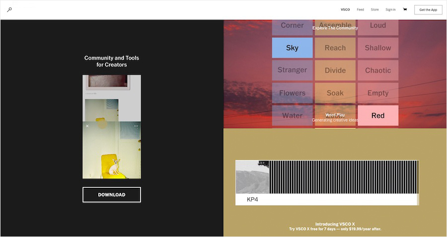
VSCO supports photographers - and relies on a simple homepage. Source: vsco.co
Shapes - colors - statements - the portfolio of designer Jean Baptiste Giffard. Source: digitaldesigner.cool
Over the last few years, flat design without much depth has become very popular. Clear, graphic and reduced to the important things. In 2018, this design is refined, with more depth through light shadows. From the user's perspective, this makes elements easier to distinguish from each other and helps direct the user's focus. The user experience (UX) improves significantly and important things can be brought to the fore better.
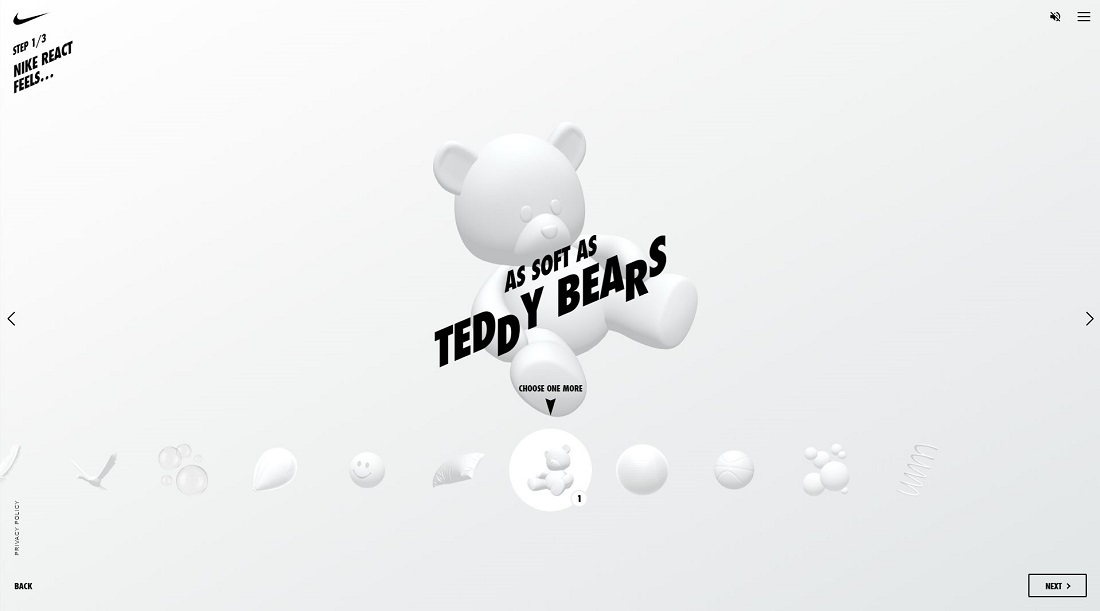
Nike React. Source: nike-react.com
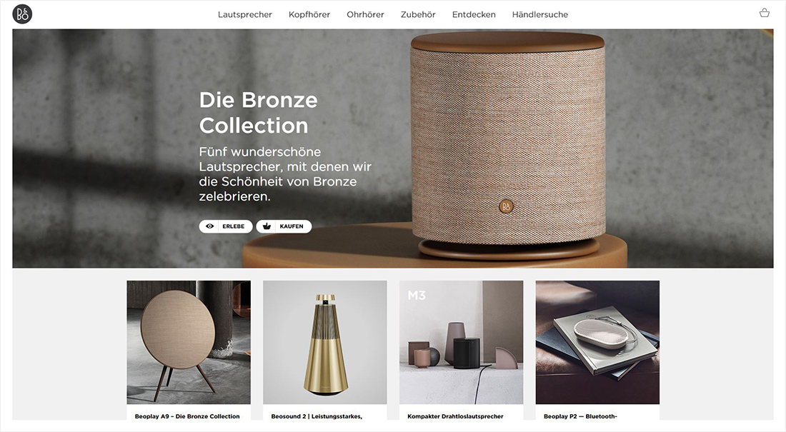
The use of contrast and appropriate imagery creates depth without distraction. Source: beoplay.com/en-en
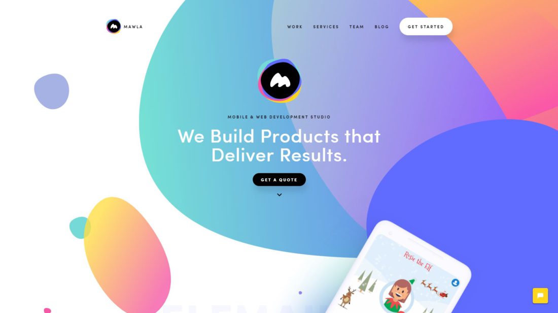
Looks flat yet three-dimensional. Source: mawla.io
Big companies like Spotify or Stripe are not afraid to use bold colors and gradients. Blue, purple, pink and green are way out in front. The transitions of the individual areas on the website are no longer straight and horizontal, but also sometimes diagonal, in wave form or a color gradient into the next area. Everything is a bit looser and yet clearly separated. In addition, dynamic scroll effects are often used, in which the content gradually appears the further you scroll. This makes the website look more dynamic and interesting.
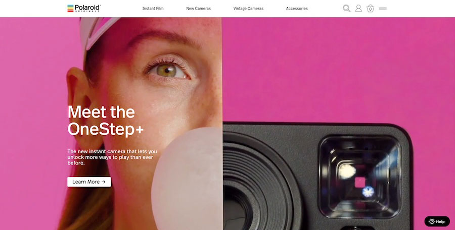
Source: eu.polaroidoriginals.com
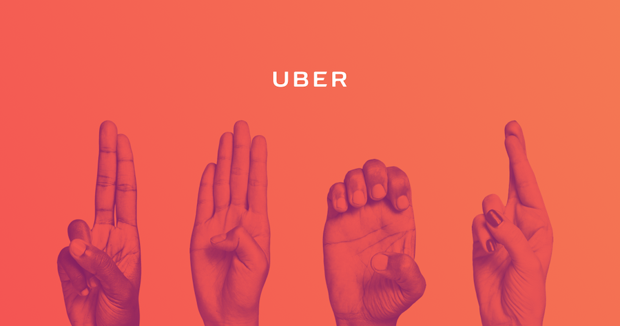
Uber Sign Language. Source: ubersignlanguage.com
A big trend for 2018 is also the use of illustrations and animations instead of simple stock photos. Companies like Kontist, for example, work with illustrations created especially for them to match their own branding. Others are using gifs and cinemagraphs, for more entertainment and dynamism on the website. The content as a whole becomes more lively and authentic if you don't just use photos. The user usually stays longer on the website. However, you should not use too many such elements, so as not to reduce the loading time and make the page too choppy.
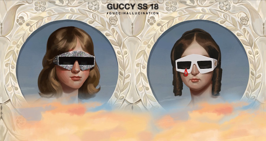
GUCCI Springsummer. Source: springsummer.gucci.com
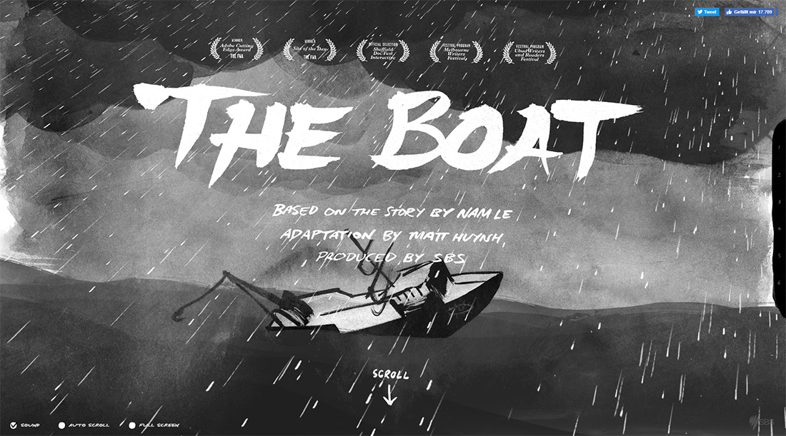
The Boat. Source: sbs.com.au/theboat/
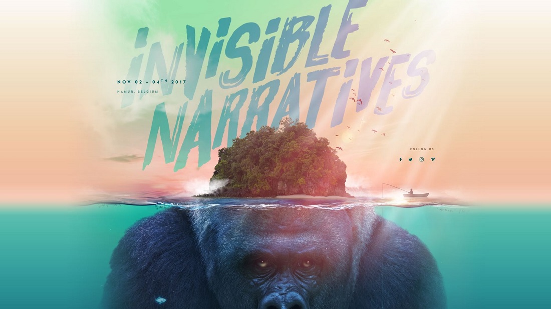
KIKK Festival with animated underwater world. Source: kikk.be/2017/
Until a few years ago, using fonts other than the standard ones available on a website was almost impossible. Today, thanks to high-resolution displays, you can dare to use special fonts and only need a few lines of CSS code. Especially serif fonts are on the rise and are used creatively. The user experience is improved and text can be made more legible. The focus of the user can be directed by the use of typography.
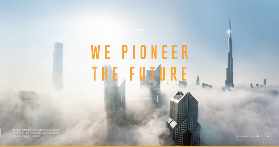
Clear statement from logistics company ACME. Source: acme-experience.com
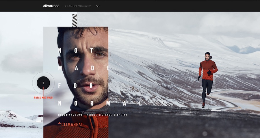
ADIDAS is going for typography with high mileage here. Source: adidas.co.uk/climazone
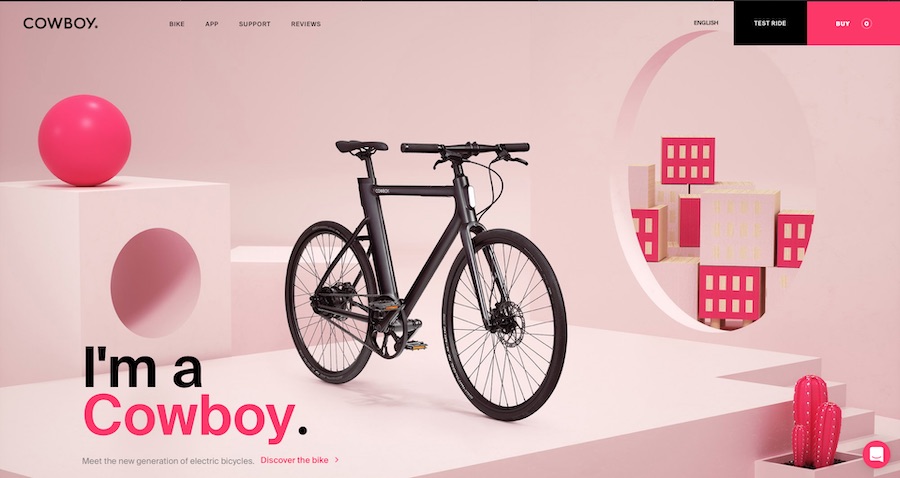
Minimalist, modern and with eye-catching typo. Source: cowboy.com
In the past, websites usually only focused on the product, but not on the people behind it. As a user, you could hardly get a picture of the people in the background and thus identify less with the brand. In 2018, it is particularly noticeable that photos of people are increasingly appearing on websites, regardless of whether this company offers products or services. Targeted storytelling creates more connection between the user and the company.
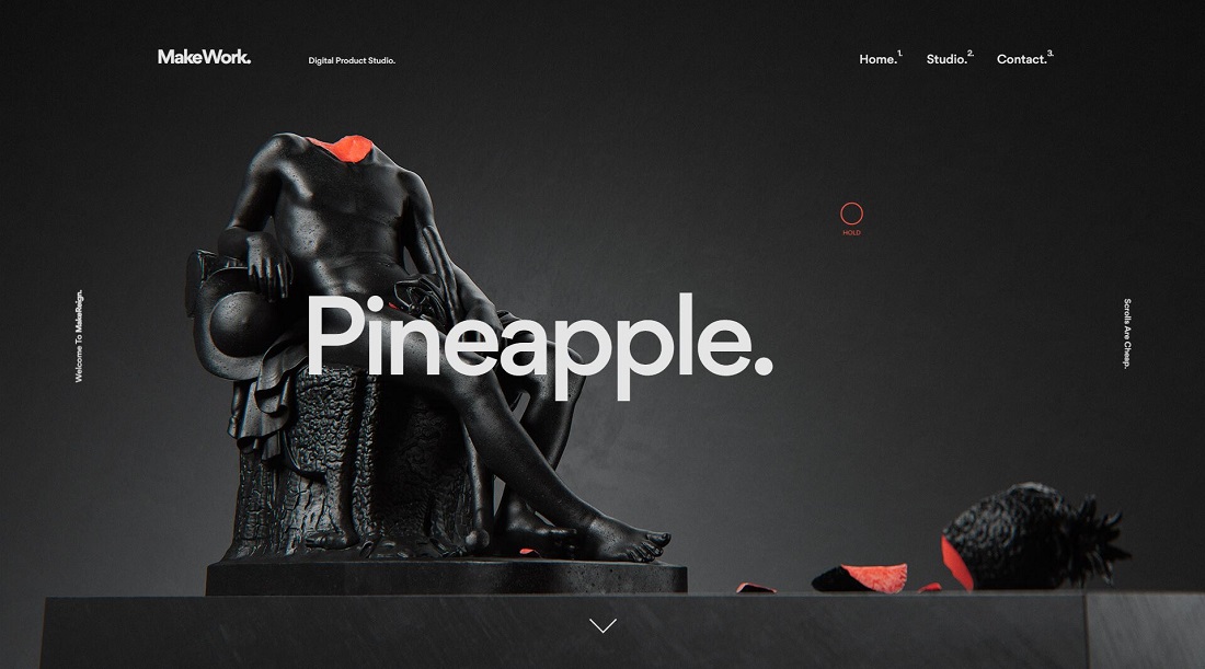
Here, separate images were rendered for each portfolio project - absolute top league. Source: makereign.com
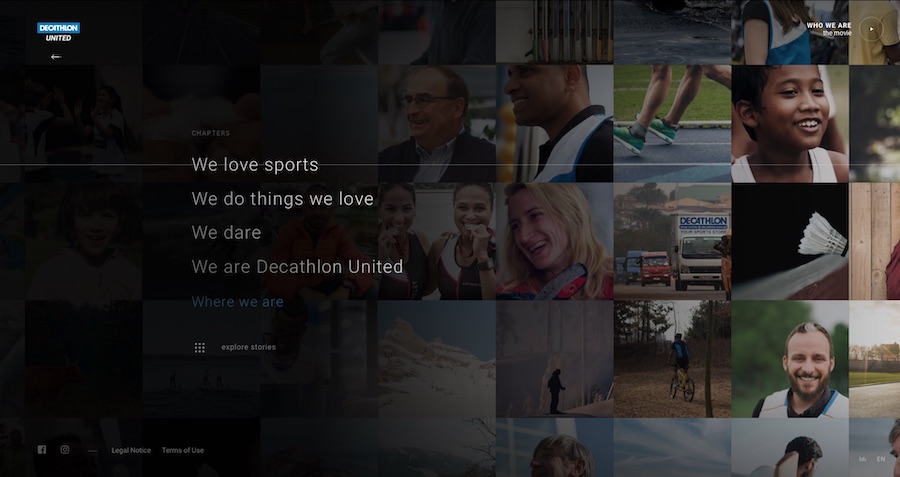
Images of people move and create authenticity. Source: decathlon-united.com
Pinterest led the way and tried something completely new in design. Now this trend has also arrived in web design 2018. The card design has the great advantage that the user can use the website intuitively and understand it easily. Moreover, this design is perfectly adaptable to mobile devices such as smartphones and tablets. Responsive design can be implemented perfectly, so that the website is displayed optimally on any device.
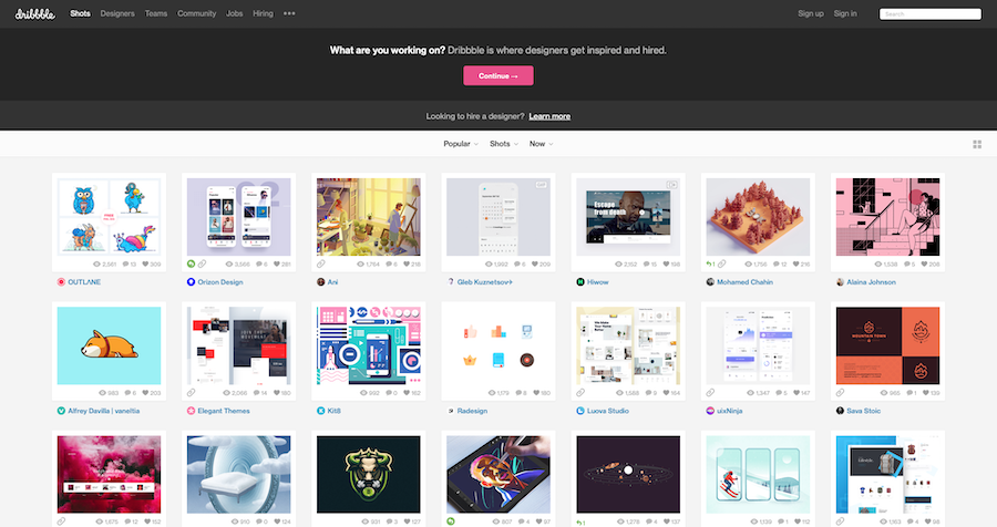
Here the user can quickly find his way around. Source: dribbble.com
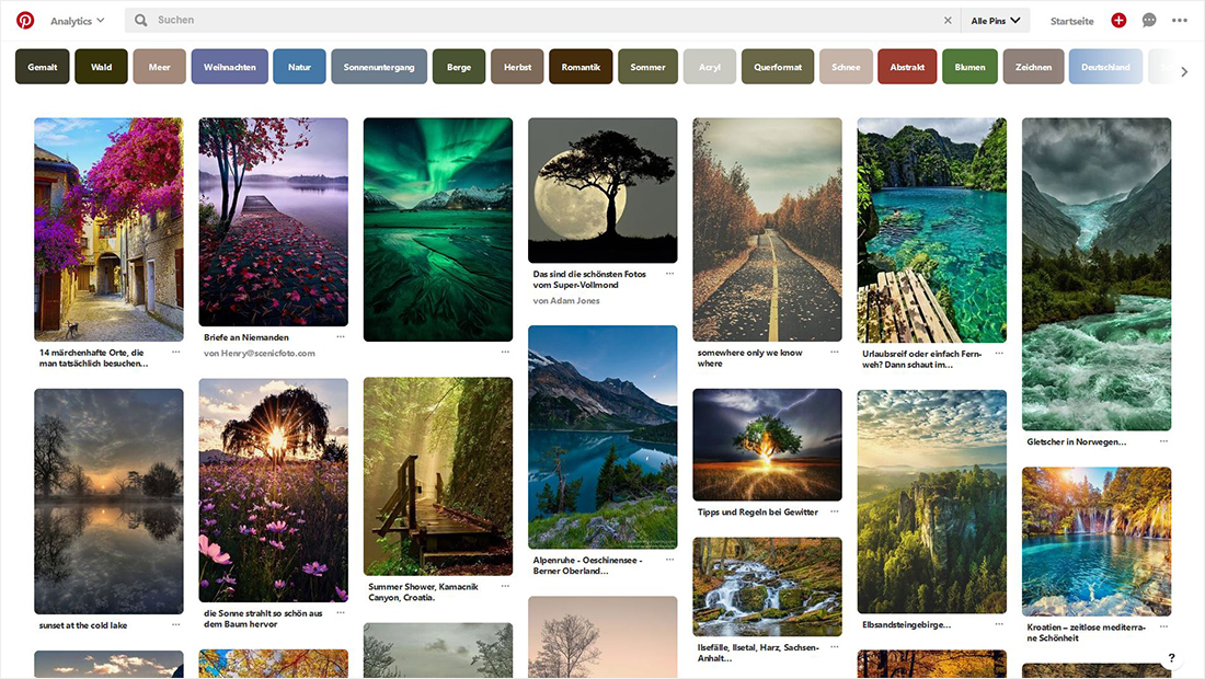
Pinterest is famous for the tile layout. Source: pinterest.com
The content can be creative in many ways, but you must never forget to optimize everything for mobile devices. Google has announced it. The ranking algorithm will be changed to mobile-first indexing in the long term. Websites should therefore be adapted for mobile devices at an early stage in order not to slip to the bottom of the ranking or even disappear completely. Responsive design is therefore very important since 2018 at the latest and should always be taken into account.
If you feel like giving your website a new look or need help optimizing it, get in touch with us! We'll be happy to help you creatively stage your website and optimize it for search engines. Come by for a cup of coffee and we'll discuss what we can do for you. We offer modern web design with responsive code and support in maintaining your website. Our team has years of experience and knows what your website needs to make your business even more successful. So book a non-binding consultationso that we can get to know you and your company. We are looking forward to meeting you!